Great content starts with a strong aesthetic—and nothing pulls that together quite like a solid color palette. For 2025, we’re turning to the experts at Pinterest to guide the way! Using insights from millions of searches and saves, Pinterest has identified the top five trending colors set to shape everything from campaigns to social feeds.
As you know by now, we’re all about creating visuals that resonate, and these colors are here to help you stay ahead of the curve. From vibrant Cherry Red to soft Alpine Oat, these shades are more than trends—they’re the foundation for crafting beautiful content that is proven to capture attention and drive engagement.
How Pinterest Predicted 2025’s Colors
Pinterest has a unique perspective on trends, thanks to the way users plan and save ideas for the future. The 2025 Pinterest Palette is backed by data: search terms like “cherry red fashion” and “soft yellow aesthetics” were mapped against engagement metrics, helping to identify the shades that Pinners can’t get enough of.
The result? A curated selection of five hues that are ready to influence culture at large—and your creative projects. Whether you’re crafting ad campaigns, styling photo shoots, or building cohesive video sets, these colors are a must for keeping your content on point.
You can read the full report here! In the meantime, meet the trending colors of 2025.
Cherry Red (#74070E)
This bold, confident hue commands attention wherever it’s used. Whether you’re creating high-energy ads or striking visual accents, Cherry Red adds a layer of passion and power to your content. Use it to make bold statements in campaigns for fashion, lifestyle, or even tech.
You can explore videos in Cherry Red on Packsia here.
Butter Yellow (#FFEDA8)
Soft, warm, and full of charm, Butter Yellow is a playful shade perfect for spring campaigns or whimsical branding. Use it as a focal color or subtle highlight to brighten your content and create a sense of optimism. It’s particularly effective in lifestyle shoots, product ads, and feel-good videos.
You can explore videos in Butter Yellow on Packsia here.
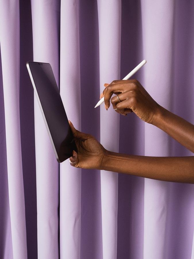
Aura Indigo (#B0A6DF)
Moody yet magical, Aura Indigo brings an edge to any creative. Its rich, cosmic vibe makes it ideal for celestial themes, mysterious storytelling, or sleek, futuristic content. Pair it with metallic accents or muted tones for an otherworldly effect that stands out.
You can explore videos in Aura Indigo on Packsia here.
Dill Green (#4E6813)
Fresh and unexpected, Dill Green is perfect for quirky, playful campaigns. Use it in food-focused videos, trendy lifestyle shoots, or anything that needs a splash of vibrancy. This shade is ideal for brands looking to stand out while staying current.
You can explore videos in Dill Green on Packsia here.
Alpine Oat (#F0E7DA)
As the ultimate neutral, Alpine Oat adds texture and warmth to your visuals. Whether it’s cozy winter campaigns, product styling, or earthy branding, this shade pairs beautifully with almost any other color. It’s a great foundation for creating timeless yet trendy content.
You can explore videos in Alpine Oat on Packsia here.